Why does native UI still matter?
In this day and age, most software being created have a completely different visual style from each other. It’s often the case that Electron is used and, because you have to re-implement all widgets anyways (a problem which has been solved since the 90s, but not for HTML), you end up going for your own unique style (notwithstanding web GUI frameworks)
But what IS native UI?
The way I would define it is an UI that’s used everywhere in an operating system. It’s the one that the user is the most familiar with. It doesn’t just include the paradigms (like having a text box) but also the specifics (like the keyboard shortcuts of a text box)
macOS and iOS
Using native UI would only be good if the native UI is usable and has enough things going for it.
One example of a company that does good native UI is Apple, it’s good whether it’s macOS or iOS. They made one1 widget toolkit that’s used with every official application. It’s sleek and automatically follow Apple’s latest design patterns through OS updates.
Thus, an application has everything to win by using native widgets: it’s automatically updated, it contributes to a feeling that the system is integrated, and the API is good (or at least better than the competition). And on Apple ecosystem, something magical happens – users expect applications to follow the macOS design, because it’s what they’ve been used to. This makes Electron applications feel more like outliers and native applications feel right at home.
To create this feeling, Apple made one thing important: every base application uses the same macOS design. This seems perfectly logical given that a native UI is the operating system’s UI.
Windows
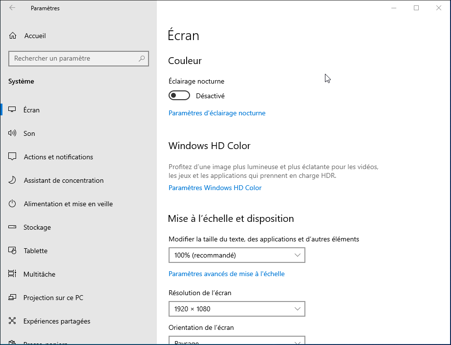
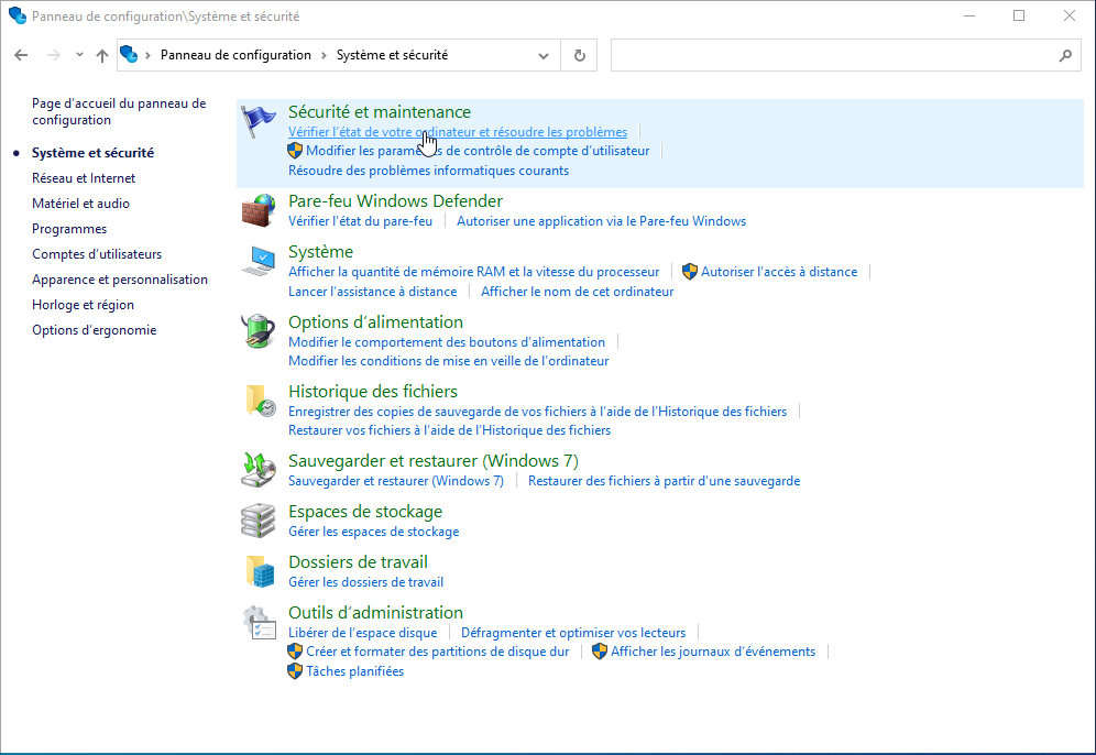
But Microsoft is illogical. It’s currently drowning under different UI toolkits2 used for their different applications. Be it Settings, Microsoft Store, Office 365 or Task Manager. They all look different. There’s now win32, WinForms, UWP, WPF, WinUI 2, .NET MAUI, WinUI 3, and maybe more? or it turns out it’s WinUI 2/3 because they’re both maintained and recommended at the same time???
There’s no coordination inside Microsoft and it suffers of the NIH syndrome, but between each Microsoft team.
Every single thing I listed is used by at least one official Microsoft application.
So in the same Windows version you can find both UI:


In the end, the only thing that stood the test of time is win32, with its horrible API. It’s still used by most native applications, and Windows backward-compatibility allows you to run a 2000s app without modification and it’ll have the “Windows 10” look3. win32 is the only stable ABI and Microsoft is wasting it.
Linux
Who knows?
The thing with Linux is that there’s no official GUI library because Linux is just a kernel. It’s not an operating system. That’s why making a GUI that “supports Linux” is kind of a misnomer, you don’t actually support Linux, you support some GUI library that runs on X11/Wayland that runs on Linux.
This is also the case with Capy where I used GTK+ for compiling to Linux. It’s not ideal but it works.
Doing It Yourself
Drawing widgets yourself can be beneficial because it allows you to hyper-optimize and tune it so that it can fit the application’s workflow perfectly and speed up processes for power users. The problem is that you lose familiarity and add up a learning curve. The case where this is acceptable is often for apps that already have a steep learning curve.
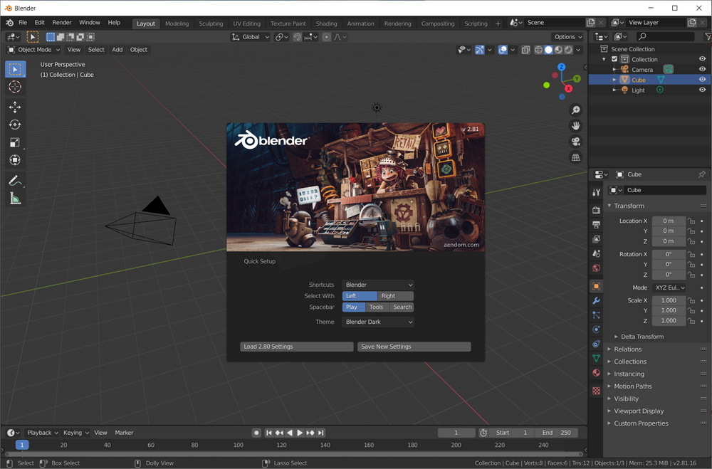
This is the case of apps like Blender or Adobe Photoshop. The fact that you need whole years to master the craft these applications allow you to do makes the small UI’s learning time insignificant. After all, when you have to learn a new way of thinking, buttons not looking like what you’re used to is far from being the biggest roadblock.

But while I said that using a custom UI in those software is not a disadvantage, I didn’t say that it is always an advantage. For instance, even for software like Blender, native UI could have been used and the 3D view isn’t an obstacle to that. In fact, the main reason a custom UI was adopted for Blender was because it is not easy at all to extend native widgets and add more features to them. And a lot of productivity and creativity software need to add more features to widgets. So from that point of view, it only makes sense.
Overall
So what can we really say?
Except for a few rare exceptions, like specialised software that require inventing new GUI paradigms, native UI is better because it encompasses all the habits the user has already learnt and helps discoverability by making the user not have to discover things. If you use native UIs, users already know how the widgets work so they don’t have to discover anything new.
Personally, I’d choose native UI for most things, and custom components whenever I need to extend functionality. But depending on how you view things, the fact that your application is customized / looks different on every OS can be a disadvantage, such as if you prefer your branding to be visible and prominent.
There’s also a very important factor I didn’t mention: developer experience. The “Doing It Yourself” is mainly comprised of Web folks who don’t want to learn a new language and don’t want to learn new paradigms. And, let’s admit it, Electron is easier to code for than Qt or wxWidgets (mainly because C++ is horrendous).
Well, SwiftUI is on the way to deprecate Cocoa which had deprecated Carbon. But it’s night and day compared to Windows. ↩︎
Instead of properly updating win32 / ComCtl32 and making wrappers on top of it, Microsoft engineers succumbed to the dreaded act of reinventing the wheel because it was made 30 years ago and no one touches 30 years old code with bare hands. ↩︎
For some reason, probably because Microsoft, win32 has been updated in Windows 10, but not to make it use the Fluent design, which is the only semi-consistently design system used by Microsoft. Instead it’s some weird hybrid between Windows 7 and flat design. As such, the last version where win32 really looked native is Windows 7. Really, Windows 7 is still the best Windows version. ↩︎